Estée Lauder - Product Page Enhancements
Investigating optimal UX practices to showcase product shades and elevate the overall user shopping experience across.
Maximum Shade Picker on The Product Detail Page
Given the extensive range of shades offered for various products such as lipsticks and foundations, Estée Lauder is actively investigating the optimal method for showcasing these shades, aiming to enhance the shopping experience for our customers.

The Goal
Assess which shade display approach users favor and uncover the rationale behind their selection.
Gain insight into the decision-making process when users are confronted with an extensive array of shades.
Investigate users' requirements for a shade filtering feature and explore potential design strategies.
User Testing Initiative
We executed an unmoderated UserTesting study as part of the UX design process, where we successfully recruited and engaged 30 participants. These participants were tasked with completing a series of assignments using pre-designed prototypes and responding to specific questions.

Design Phase
Maximum Shade UX Design Options

Shade Filter UX Design Options

Key Takeaways
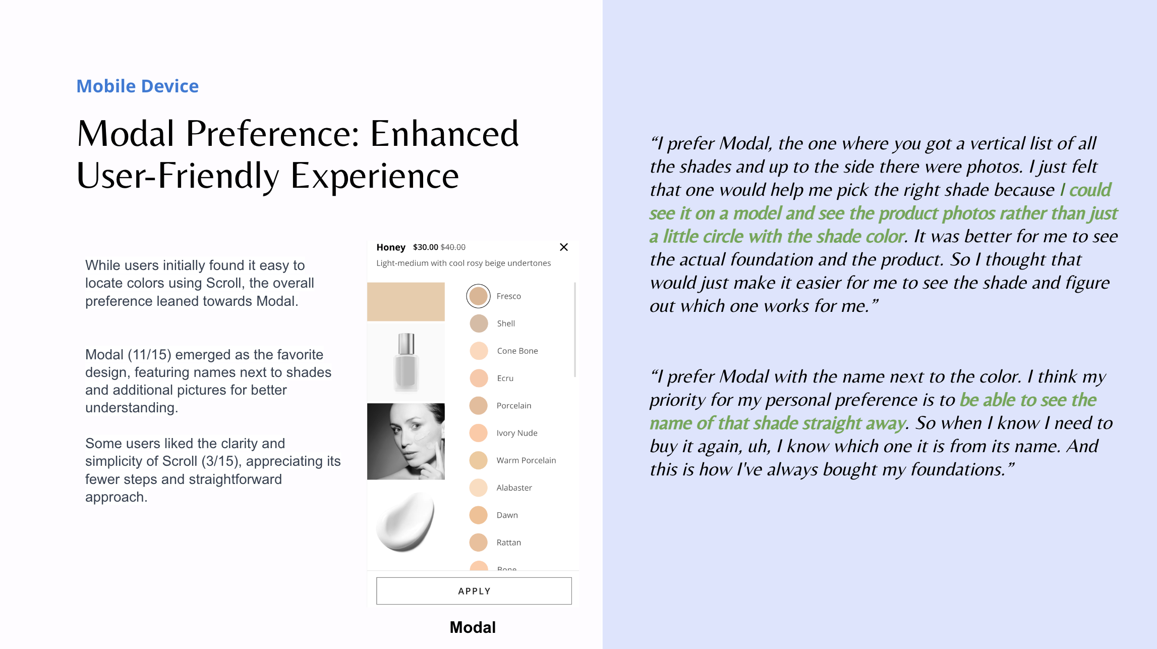
A notable majority of participants (11 out of 15) preferred the Modal design due to the shade name's proximity to the color, expediting selection. Users also valued the additional pictures provided, enhancing their understanding of each shade.
On desktop, users found the Scroll design easier for color selection. The primary reason was that shades in the Modal design were not organized in gradient order. While users still found the Modal design clear and easy, improving color organization is recommended.
Include a shade filter since the majority of participants used it, with "light to dark" being the most popular category.
Users overwhelmingly prefer gradient-ordered color organization for easy selection.
Insight Deep Dive


Shade Drop Down on The Product Listing Page
Based on findings from prior Modernization work on the Product Detail Page and Product Listing Page, users who recall shade names prefer a "drop-down menu" or a swift method to locate the desired color on PLP. This allows them to efficiently add products to their bag without navigating to the PDP page. Consequently, the research team has initiated this usability testing to determine the most effective approach to meet users' needs.
What we hoped to learn:
Investigate user preferences for shade/size drop-down designs and their reasons.
Understand user decision-making amidst a large array of shades on PLP.
Evaluate the current design's effectiveness in swiftly guiding users to the desired shade/size.
Hypothesis:
Users are likely to favor a "dropdown" menu on the PLP, anticipating that this design will enhance their ability to find colors more efficiently.
The hypothesis is based on the observed trend among users, indicating a preference for the "dropdown" menu on the PLP. The assumption is that this design choice is perceived as conducive to a faster and more effective color-finding experience.
Testing Method
We employed an unmoderated study using UserTesting, recruiting 31 participants who were tasked with completing a series of assignments involving pre-designed prototypes and accompanying questions.

Design Phase
Shade Drop Down UX Design Options

Size UX Design Options


